 Back in 2007, Dell had more than 800 creative agencies around the world working on the Dell brand. This created a number of problems such as there being more than 15 different typefaces for Dell in the English language as well as a number of slightly different logos.
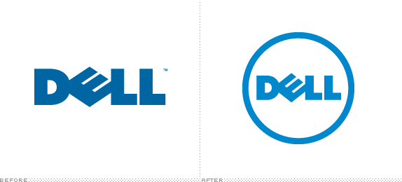
With that in mind, Dell is now moving to a single logo design (pictured below) that will be used across all Dell products. The colour of it isn’t just blue, it’s actually called Dell Blue and isn’t available in any colour book.
In taking ownership of the Dell brand the team established a direction, and then partnered with Lippincott to customize its look and feel. The team worked with type designer Jos Buivenga to tailor a typeface (Museo) specifically for Dell and they introduced a brighter palette led by a custom Dell blue solid ink formula that cannot be found in any color systems book.
In this way, too, the Dell logo was finally refined. The iconic mark — redrawn to support smaller applications, and with its own blue ring surrounding and protecting the wordmark — has already been rolled out across the company’s millions of brand touch points. With support from Lippincott and Y&R, the Dell logo stands strong and is what you see today at Dell.com.
So there you go! There should be no confusion now, if there was any at all. A lot more of the finer details can be found at the Via link below which includes the various colours and where the logo is being used.
Via: Under Consideration


Speak Your Mind
You must be logged in to post a comment.