 When Google announced the Android 3.0 SDK download yesterday, it allowed developers to run and grab a copy of the new version of Android so that they can begin testing apps ready for the official launch next month.
The Motorola Xoom will be the first tablet to run Android 3.0 Honeycomb when it launches in February.
With the availability of the SDK, it has allowed us to get a sneak peak in to what’s expected on new tablets thanks to the work of Ars Technica.
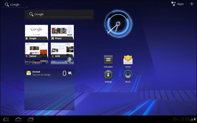
The home screen on 3.0 uses widgets that can scroll. This allows for more content to be on the home page such as email, weather reports, appointments etc…

A number of items can be easily dragged to the home screen such as icons and widgets and you also get the familiar application draw that can be scrolled in to for more applications that you use less.
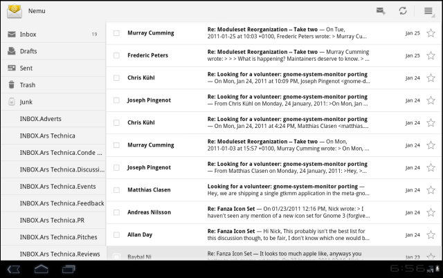
With Android 3.0 being designed for the tablet, it uses a dual pane setup like the iPad does which works well for email and other apps with content that can be opened (as seen below)…

Rather than repeat what Ars Technica has said, check out the full post over on that site to see what Android 3.0 will bring to tablet devices this year. I have to say that this makes Android tablets look more appealing now.


Speak Your Mind
You must be logged in to post a comment.