I was lucky enough to get my greasy hands on a Nokia Lumia 800 recently to review. Up until a month ago I knew a whole sum total of one person who had a WP7 device; a HTC Trophy. I must admit, I was impressed with it, the OS was silky smooth and the apps had a really nice design to them utilising the paged appearance where the adjacent items can be slightly seen poking out of the right of the screen. As said, I liked it, however, I was a bit disappointed by the hardware though. The phone looked a tad boring with Microsoft obviously keep very tight wraps on even the hardware specs of the devices allowed to run the OS and HTC failing to inspire the world with the phone design.
 So, move along about a year and I find myself un-boxing a nice shiny Nokia Lumia 800. From the packaging it’s clear Nokia have aimed to produce a high end device. The packaging is small, neat and sturdy with the contents well organised. It seems the days are gone when phone packaging was the size of a shoe box. The accessories are all fairly standard, with some black headphones and a wall charger/USB cable. Here lies a small gripe though…the charger looks very similar to an iPhone charger. Now this isn’t a huge problem, except the phone is black, the USB cable is black, the boxing interior is black and yet the mains charger is a small white triangle almost identical to the iPhone’s. Why Nokia didn’t you make it a small black triangle? Black is classy, it would have looked so much better! [Read more…]


 AT&T and Apple has faced a bit of criticism over the years about the iPhone and it’s dropped call rate. It has never been completely clear as to where the fault is with some blaming one or the other.
 The FCC has taken apart the Motorola Bravo and
  The Motorola DROID 3 has appeared over on
  The popular Instapaper app for iPhone and iPad has received a major update today. The new version is 3.0 and it brings a number new features that according to the
  At the moment, the only place you can read The Daily is on the Apple iPad. This is about to change though as it seems there is an Android tablet version being prepared for launch.
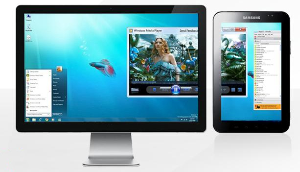
 iDisplay has been launched for Android OS based devices. What it does is allow you to use your Android smartphone or tablet as a secondary display for your computer. Once installed and connected, you can then drag windows on to the smaller screen such as a Skype conversation or perhaps a media player you want to be able to see but not clutter up your main screen.
 During the annual shareholders meeting yesterday, Apple [AAPL] was asked about the datacenter being built in Norch Carolina. In response, Apple said that the new datacenter was to be used for both iTunes and MobileMe services.
 At MWC a few weeks back, we had the chance to see the Samsung Galaxy Tab 10.1 being announced (device pictured above). We now hear rumors about Samsung releasing an 8.9 inch version that could potentially be called the Samsung Galaxy Tab 8.9.
 Some pictures have leaked of a 13 inch MacBook Pro that are believed to be the new 2011 model that could be launching as early as tomorrow.


