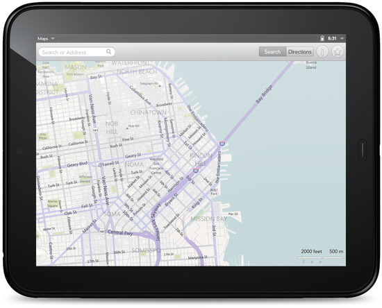
 Images of webOS 3.0 have been captured from the webOS emulator which provide us with a bit more details of what the new HP TouchPad will work like when it launches.
Screenshots that have been found include maps, browser, music as well as a few other settings menu and media screens.
What we see is quite a sleek looking interface with a decent looking keyboard and very clear menus and functions dotted around. The picture below is of the browser which shows the landscape virtual keyboard open along with a simple address bar and status bar above that.

Maps also follows suit in that it’s very simple layout looks clutter free and easy to work with. We actually quite like the look of the TouchPad and hope to see it launch soon rather than having to wait around. For more details on the actual device from the announcement date check out our full coverage over here.
More images can be found at Pre-Central.


Speak Your Mind
You must be logged in to post a comment.